Sudoku Solver
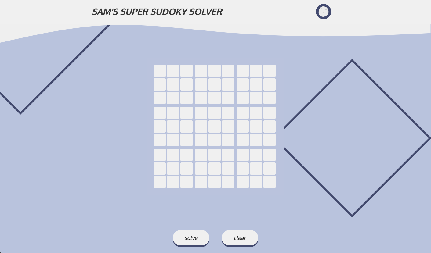
Sam's Super Sudoky Solver is a modest web application built with a very simple stack, designed to solve the popular numerical and logic-based puzzle.

My goal
I began this project to challenge my problem-solving and my ability to write succinct algorithms and to familiarise myself with Typescript.
Initially I planned to build this application with Python, however due to wanting to improve in web development I decided to make this a web-based project and create the application with Typescript. This also came with the advantages of making the app more easily accessible to anyone, and additionally gave me the freedom to create a much more bespoke and user-friendly UI with much more ease.
Stack
Admittedly I am most adept with using the Javascript framework React for creating web applications, so I decided to hop out of my comfort zone and build this application without that.
I have some experience with strongly-typed programming languages (C, C#) and I like the explicitness of of using them. This largely due to two reasons:
- When reading or working with unfamiliar code it is much easier and quicker to understand what is happening.
- It helps keep oneself accountable with the code being written and helps to minimize avoidable errors, especially with error-handling and debugging.
So I think this was a great reason to try Typescript for the first time.
There is also a minimal amount of HTML used to structure the page and CSS to style it.
Challenges
Creating the UI
This was arguably the most difficult part of development... possibly excluding writing the algorithm which solves the puzzle.
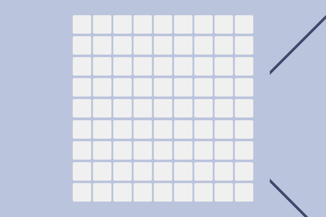
I wanted to create a sleek UI that was intuitive to use. But the matrix of inputs was tricky to organise into a recogniseable sudoku grid.
Creating and Initialising the inputs
1const createDivs = () => {2 for (let i = 0; i < 81; i++) {3 const elem = document.createElement('div');4 elem.contentEditable = 'true';56 // check for valid input7 elem.addEventListener('input', () => {8 if (elem.innerText === '') {9 if (elem.classList.contains('invalid')) {10 elem.classList.remove('invalid');11 }12 }13 if (/\D/.test(elem.innerText)) {14 elem.classList.add('invalid');15 } else if (elem.innerText.length >= 2) {16 elem.classList.add('invalid');17 } else {18 if (elem.classList.contains('invalid')) {19 elem.classList.remove('invalid');20 }21 }22 })23 puzzleArray.push([elem, NumberType.empty]);24 sudokuContainer.append(elem);25 }26}
Of course, I didn't want to write 81 <div> tags by hand and so this script creates them for me, using a For Loop. When these divs are created I am also initialising a few things:
-
As you can see on line 4, I'm making sure the element's content is editable.
-
I'm also initialising an Event Listener for each of the div elements. When the content of the div is changed the event listener triggers.
Using a Regular Expression I am checking to make sure the content is valid. The Regular Expression
\Dmatches any character that is not a digit. And so here, if the content matches the Regular Expression I'm adding the css classinvalidto the class list. This will change the background of the div to a red colour to symbolise an error. If any of the divs are invalid the 'Solve' button is pressable, but instead of solving the puzzle an error will appear which will ask the user to amend the input. -
I'm adding the div to an array which makes the div - and more importantly it's content - easily accessible when solving the puzzle.
The
NumberType.emptyattribute here refers to an enum I created. The options are NumberType.empty or NumberType.locked. Each div is intialised as empty, but once the 'Solve' button is clicked each input div that has had a number entered will be set asNumberType.locked, and this represents the numbers in the sudoku that cannot be altered. -
Finally, I'm appending the div to the
sudokuContainerelement which is the div that holds the whole puzzle UI.
Styling the inputs
1:root {2 /* sudoku elements */3 --element-size: 40px;4 --element-margin: 2px;5 --full-board-size: calc(var(--element-size)*9 + var(--element-margin)*25);6 --block-divider: 6px;7}89#sudoku_container {10 padding: 20px;11 margin: 10px;12 position: relative;13 display: flex;14 flex-wrap: wrap;15 width: var(--full-board-size);16 height: var(--full-board-size);17 grid-row: 1 / 2;18 align-self: center;19 justify-self: center;20}
The excerpt of CSS above shows the variables that I created to ensure consistency, and the styling to the div that contains the 81 sudoku input divs.
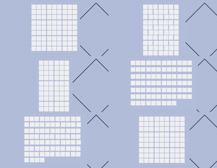
The variables --element-size and --element-margin are also used to calulate the --full-board-size variable. This variable ensures that the #sudoku_container div is the perfect size so that when the input elements within wrap to the next line, they wont appear out of line.

The gif above demonstrates how the sudoku board might appear if the width of the container isn't quite right. I'm sure most would agree that it's quite unrecogniseable and definitely impossible to use.
The CSS that targets the input divs themselves is reasonably uninteresting. But there is another style declaration which I deem very important.
1#sudoku_container div:nth-child(3n) {2 margin-right: var(--block-divider);3}4#sudoku_container div:nth-child(19), #sudoku_container div:nth-child(47) {5 margin-bottom: var(--block-divider);6}
These styles target some specific input divs within the sudoku container.
-
The first declaration uses the CSS
nth-child()selector to target multiples of 3. This creates a visible vertical divider after every third input div - a total of 27.You may have noticed that this wil also add a margin to the far right of the sudoku board. This isn't intended, but I decided to stick with it because doing it this way results in less code and no negative impact on the user. It does however affect the width of the whole sudoku board slightly, meaning the calculation of the
--full-size-boardvariable had to be amended. -
The second declaration targets only the 19th and the 47th div. Thanks to each input div having it's height set to the same variable, adjusting the margin-bottom to just one of the input-divs creates a visible horizontal divider across the whole width of the sudoku board meaning there is no need to adjust the
margin-bottomfor each input along the horizontal line.

Once again, I think most would agree that without the margins that create the visual dividers it would lead to a convoluted UI and a much more difficult user experience.
Conclusion
Although I am pleased with many aspects of this project there are many areas for potential improvement.
-
When I began this project I wasn't sure if I could write an algorithm to solve a sudoku so I'm very proud of this achievement. That being said there are certain circumstances where the app will run indefinitely and never reach a solution. Currently I don't know exactly why but as a short-term solution I have added a clear button which will stop and clear the app while it is working. I'm considering coming back to this project in the future to develop an entirely new algorithm which will avoid this problem and also be more efficient.
-
Although I'm happy with the aesthetic of the UI I have failed to consider accessibility issues. For people who navigate websites using just the keyboard this app would be impossible to use. I intend to make sure this will not be the case for any future apps that I work on.